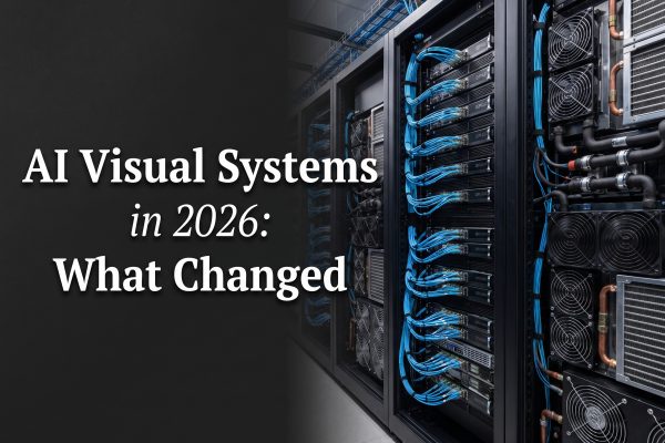
AI models for infrastructure visuals need a different test than ordinary image generators. A pretty server room does not help much if the rack proportions feel wrong, fiber paths turn into spaghetti, or a cooling loop implies hardware that cannot exist. Developers and infrastructure teams use these images for architecture explainers, launch pages, internal planning decks, and early creative direction. The job is to make a technical story easy to understand without passing a concept image off as a diagram.
This roundup compares four Wiro models against practical infrastructure briefs: a liquid-cooled aisle, an edge inference pod, an editorial GPU-rack cover, and an isolated server sled. The results are useful for visual communication, not for sign-off on physical design. That distinction matters more in 2026. NVIDIA says its Rubin generation uses fully liquid-cooled infrastructure, with coolant temperatures up to 45 C in its reference design. At those densities, cooling, network routing, service access, and power delivery all need to read clearly in the image.
What good AI models for infrastructure visuals must show
Infrastructure images carry more constraints than consumer lifestyle images. A reader should quickly identify the subject, whether it is a GPU rack, an edge appliance, a cooling manifold, or a server sled. The composition also needs room for a real headline or annotation added later by a designer. Small generated labels remain risky, even on models that handle typography better than average.
Physical plausibility is the next check. A concept image can simplify a rear-door heat exchanger or a cold-plate loop, but it should not show coolant pipes entering nowhere or a rack with no cable egress. High-density AI deployments make this scrutiny practical rather than academic. CoreSite describes air-cooled systems as designed around roughly 15 kW per rack, while liquid cooling can support 200 kW or more. That gap changes the visual language: manifolds, distribution units, service clearances, and heavier power paths belong in the scene.
The final requirement is production utility. Teams need the correct aspect ratio, negative space for copy, and a consistent style across articles or slides. A model that gives a strong first frame but cannot preserve a composition across edits may be less useful than a less dramatic model with dependable controls.
Top 4 AI models for infrastructure visuals
| Model | Best fit | What to review |
|---|---|---|
| Pruna P Image Ideogram Custom | Editorial covers and layout-led graphics | Generated copy and tiny hardware details |
| P-Image Ideogram | Explainers and system concepts | Connector paths and device counts |
| Google Nano Banana 2 Lite | Fast atmospheric scenes | Labels, exact geometry, repeatability |
| Microsoft Lens | Isolated hardware visuals | Ports, heatsinks, and component accuracy |
1. Pruna P Image Ideogram Custom
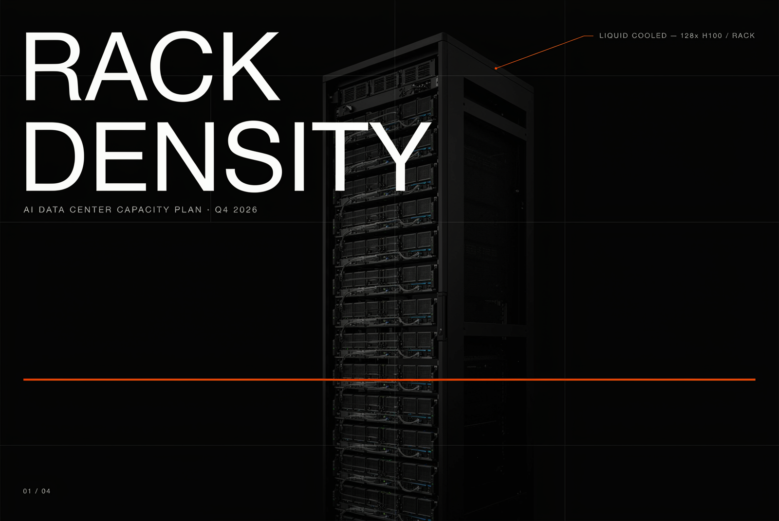
P Image Ideogram Custom is the strongest fit when the brief starts with layout. It offers explicit width and height controls, reasoning level, and output format. That is useful when an image must fit a 3:2 blog cover, a 16:9 slide, or a narrow product panel without depending on a later crop.
The original test requested a matte-black capacity-planning poster with a liquid-cooled GPU rack and a reserved headline zone. It produced a usable editorial structure. The lesson is not to trust generated wording. Keep the visual prompt free of required microcopy, reserve empty space, and add the final title in a controlled design tool. This reduces one of the common failure modes in infrastructure art: an otherwise persuasive image undermined by one invented label.
2. P-Image Ideogram
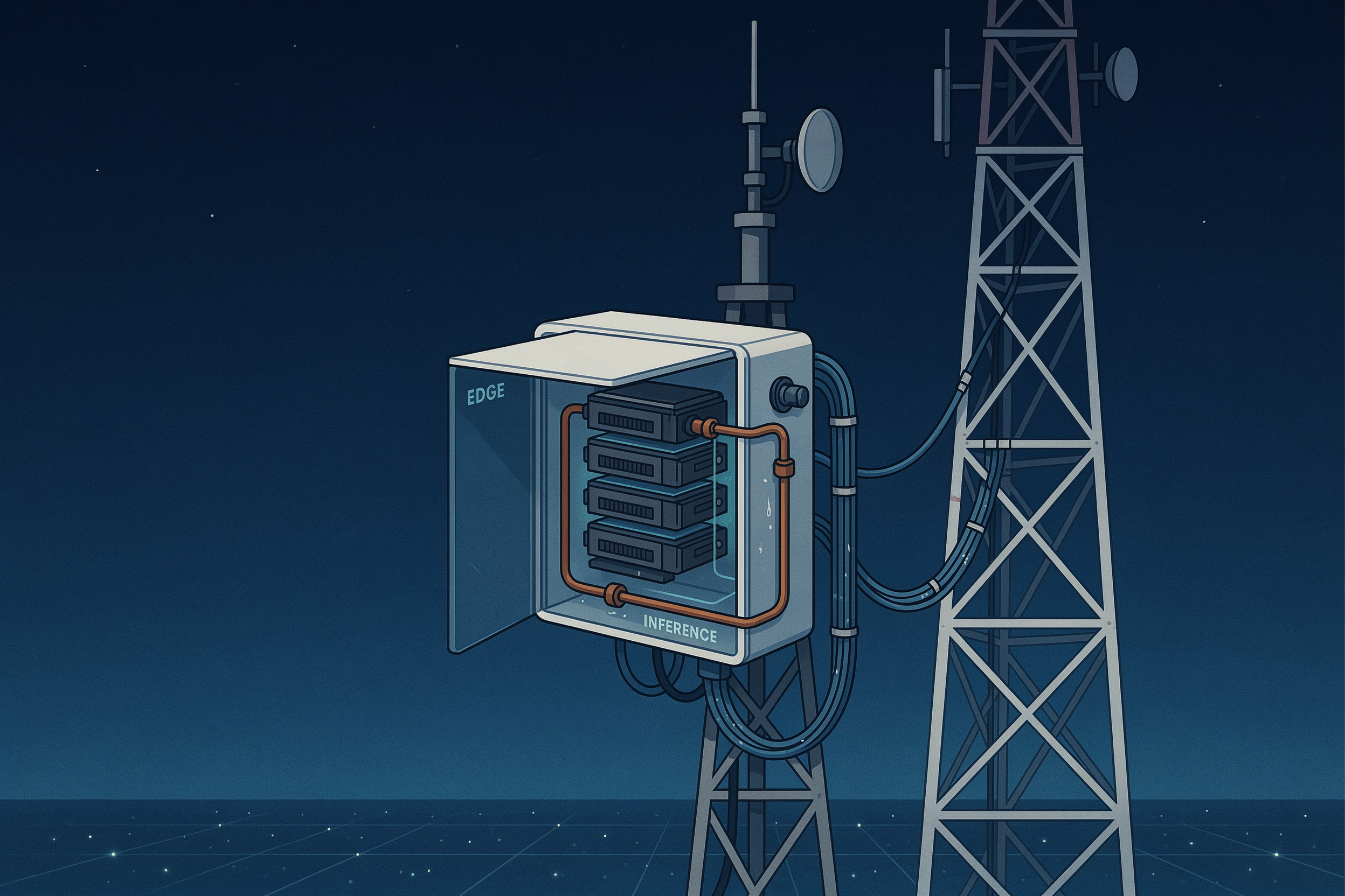
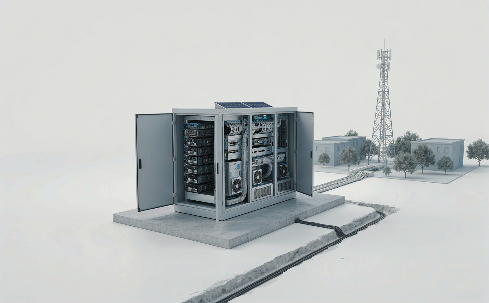
P-Image Ideogram works well for an approachable explanatory frame. The edge-inference prompt combined a compact GPU module, fiber links, and a telecom setting. That makes it a sensible option when a post needs to explain where inference happens rather than document the exact chassis.
Use it to establish hierarchy: compute at the center, networking around it, and the edge site in the background. Do not use it as a network map. Generated cables can cross in visually attractive but operationally impossible ways. A good finishing pass replaces those paths with a vector overlay and names only the interfaces the team has verified.
3. Google Nano Banana 2 Lite
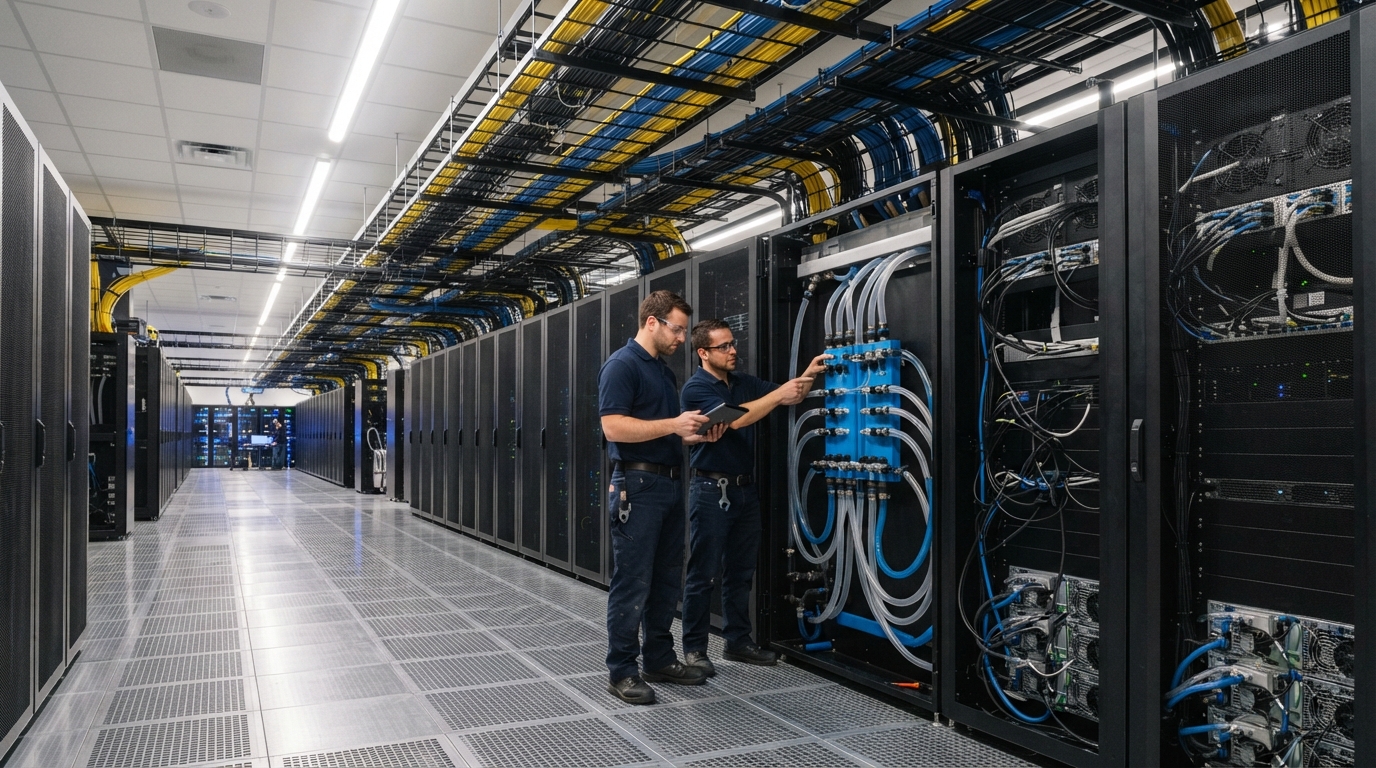
Google Nano Banana 2 Lite is the fast option for scene exploration. Its 1K output and preset aspect ratios make it useful for testing a visual direction before a team commits effort to a full illustration. The liquid-cooled aisle prompt produced coherent lighting, technicians, overhead fiber trays, and an obvious maintenance setting.
That is enough for a blog hero or a presentation section divider. It is not enough for a cooling layout review. Treat every pipe, connector, and rack face as illustrative. Teams should verify critical claims against the vendor design material, then add any exact diagram elements separately. NVIDIA’s June 2026 cooling overview is a useful source for the broader design context: it describes closed-loop liquid cooling and explains why higher coolant temperatures can reduce mechanical cooling demand.

4. Microsoft Lens
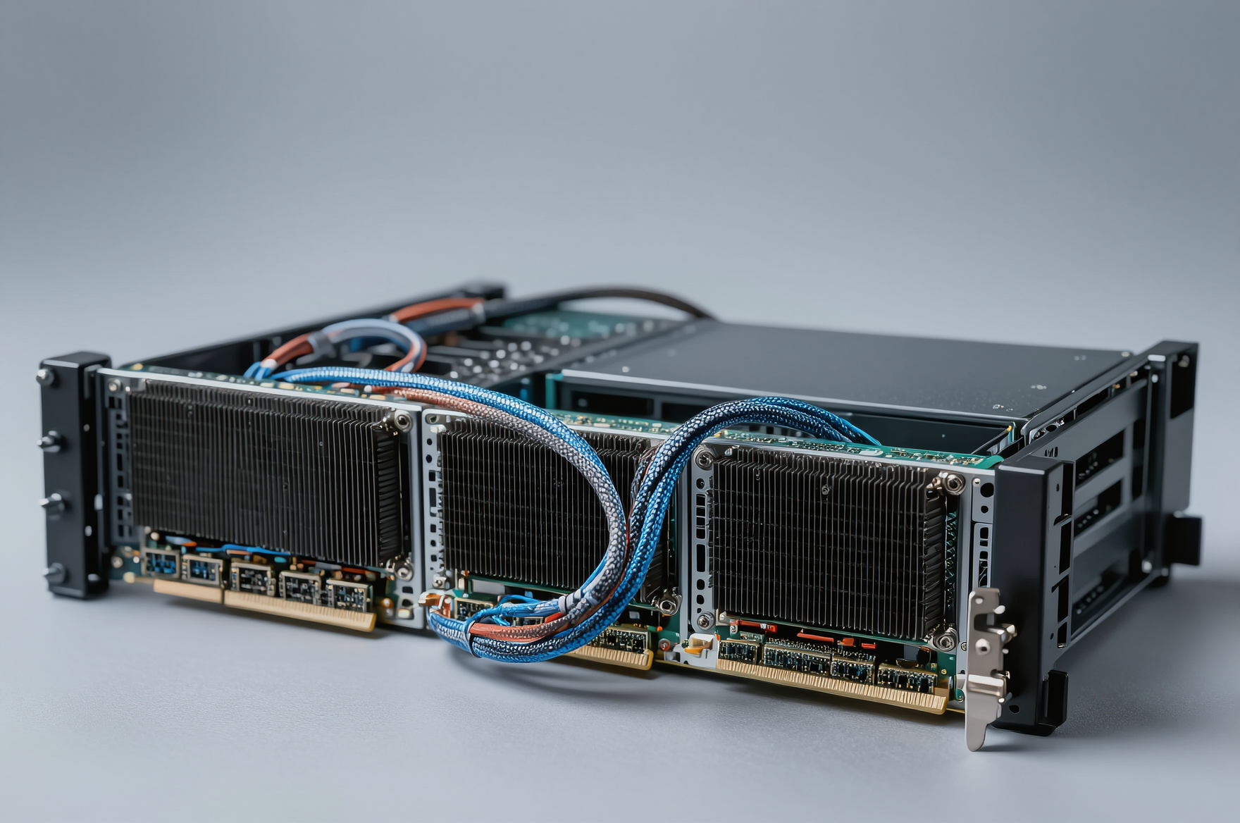
Microsoft Lens is the natural choice in this group for a clean, isolated hardware visual. The server-sled brief asked for heat sinks, coolant lines, and PCIe connectors. The result gives product and developer-relations teams a polished object image that can sit beside a specification, release note, or deployment guide.
Its limit is also clear. A photorealistic component image can look authoritative while inventing a port, an airflow route, or a board outline. Use the output as a communication asset. For technical documentation, start with an approved CAD render, product photograph, or vendor diagram and use generated art only around it.
A practical workflow for infrastructure teams
Start with the decision the image must support. For a capacity-planning article, ask for a wide aisle, visible cooling distribution, and a clean left or right margin for a verified headline. For an edge deployment explainer, request one compute enclosure, one clear network path, and one environmental cue such as a tower or branch site. Fewer competing objects lead to fewer invented relationships.
Then run a plausibility review with someone who knows the system. Check rack orientation, front versus rear access, cable routes, liquid loop endpoints, and whether the image accidentally presents a concept as a product. Remove generated text. Add final labels, arrows, and numerical claims only after source review. This is faster than trying to prompt a finished architecture diagram into existence.
Keep a small prompt record with model, aspect ratio, date, and intended use. It gives the team a repeatable visual baseline and makes it easier to trace an asset when a release changes. For a second reference point on the cooling transition, CoreSite’s liquid-cooling discussion outlines why higher-density racks push facilities beyond the assumptions of traditional air cooling.
Which model should you choose?
Choose Pruna P Image Ideogram Custom when layout control matters most. Choose P-Image Ideogram for clear, friendly explanatory scenes. Choose Nano Banana 2 Lite for quick atmospheric exploration. Choose Microsoft Lens when the story needs a single hardware object. None replaces an engineering drawing, a bill of materials, or vendor-approved product art.
The best workflow combines generated visual direction with human technical review. Run and scale these models on Wiro when the brief is clear, then finish the asset with verified labels and approved facts.