P Image Ideogram matters when an infrastructure image must explain a system before anyone reads the body copy. GPU briefs, capacity-planning decks, and incident retrospectives all need visuals that make a technical point fast. This expanded review tests where the model helps, where it introduces risk, and how to keep generated imagery out of the path of operational truth.
The test set used P Image Ideogram Custom on Wiro at 1536 by 1024 pixels, high reasoning, disabled prompt upsampling, and JPEG output. The five original prompts move from atmosphere-led artwork to structured diagrams. Two new infrastructure scenes were added for this update to check how the model handles rack density, cooling hardware, cable routing, and a human scale reference without relying on generated labels.
P Image Ideogram test setup
Each original run asked for one primary idea. That constraint matters. A generated image can usually establish hierarchy: a rack aisle, a cooling loop, an operator console, or a request path. It is far less dependable when the prompt asks it to behave like a CAD drawing, a network topology, and a typeset poster at the same time.
- GPU cluster aisle with a headline
- Liquid cooling diagram
- Inference operations dashboard
- Hardware room poster
- End-to-end inference pipeline diagram
Why infrastructure teams should care
Image generation is not a benchmark for an inference service. It is a communication tool around that service. Teams still need measured throughput, tail latency, power draw, and failure data from their own stack. MLCommons describes MLPerf Inference as a suite that measures how fast systems process inputs and produce results, which is the useful distinction here: a visual can frame the question, but it cannot replace the measurement. See the MLPerf Inference Datacenter benchmark for the benchmark context.
That boundary is especially important in capacity planning. A single rack image can suggest that liquid cooling, optics, and GPUs form one neat installation. In a real deployment, flow rates, facility water temperatures, rack power limits, cable bend radius, and maintenance clearance all affect the design. Use generated visuals to help a reader understand the system boundary. Keep source-of-truth diagrams and figures in the engineering tools that produced them.
Text rendering remains relevant because infrastructure work crosses engineering and communication. Ideogram says its 3.0 model emphasizes prompt alignment, photorealism, and text rendering, with reusable style references. That makes the family a reasonable candidate for a cover, report hero, or concept graphic. It does not turn tiny labels into audited data. The model claims are documented on the official Ideogram 3.0 page.
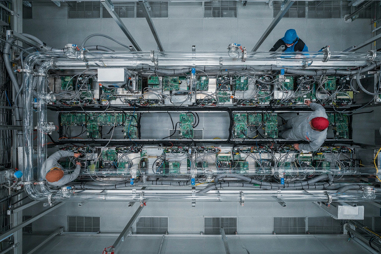
The new cooling-room output gets the high-level physical story right: parallel rack rows, manifolds, hoses, and service access communicate a liquid-cooled installation immediately. It is useful as a report opener because it gives the reader scale without pretending to document an actual facility. It should never be used to show a specific coolant loop, valve state, or maintenance procedure.
Results from five infrastructure tests
Test 1: GPU aisle headline
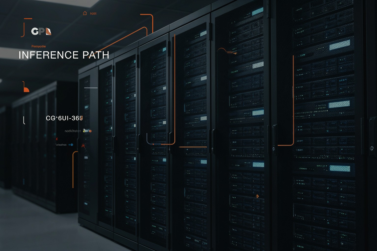
The first output sets a useful baseline. The rack aisle reads as an operating environment rather than a generic neon tunnel. Cool status lights and copper pipes give it an infrastructure cue. The headline sits away from dense hardware and remains readable. Short phrases work best. Longer copy needs a separate layout pass, even when the first result looks convincing at thumbnail size.
Test 2: cooling budget diagram
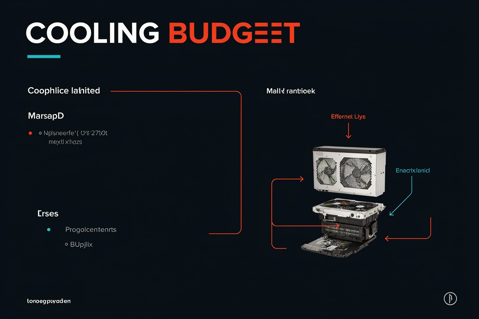
The cooling prompt is harder because it asks the model to explain a physical system. The output creates an immediate story through manifolds, pipes, and heat-exchanger shapes. The title survives cleanly. Small arrows and labels need review before production use. A cooling diagram may look plausible while reversing a flow direction or omitting a bypass. Redraw every connection that carries an operational decision.
Test 3: operations dashboard
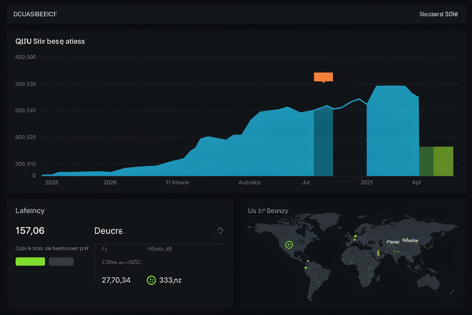
The model balances UI density with a usable focal point. Large labels are more dependable than small telemetry text. That makes this a good fit for a product concept, sales deck, or article illustration. It is not a working front end and should not be treated as a source of real measurements. Developers should define the actual metrics first, then use the image as a visual companion rather than a mock dashboard to copy.
Test 4: token factory poster

This was the most editorial test. It combines a human subject, hardware texture, weather, and signage. The words behave like part of the setting rather than a pasted overlay. That is useful for original reporting visuals. Teams with a strict identity system should add approved type, legal marks, and accessibility copy after generation. Treat the output as art direction, not a brand file.
Test 5: inference pipeline
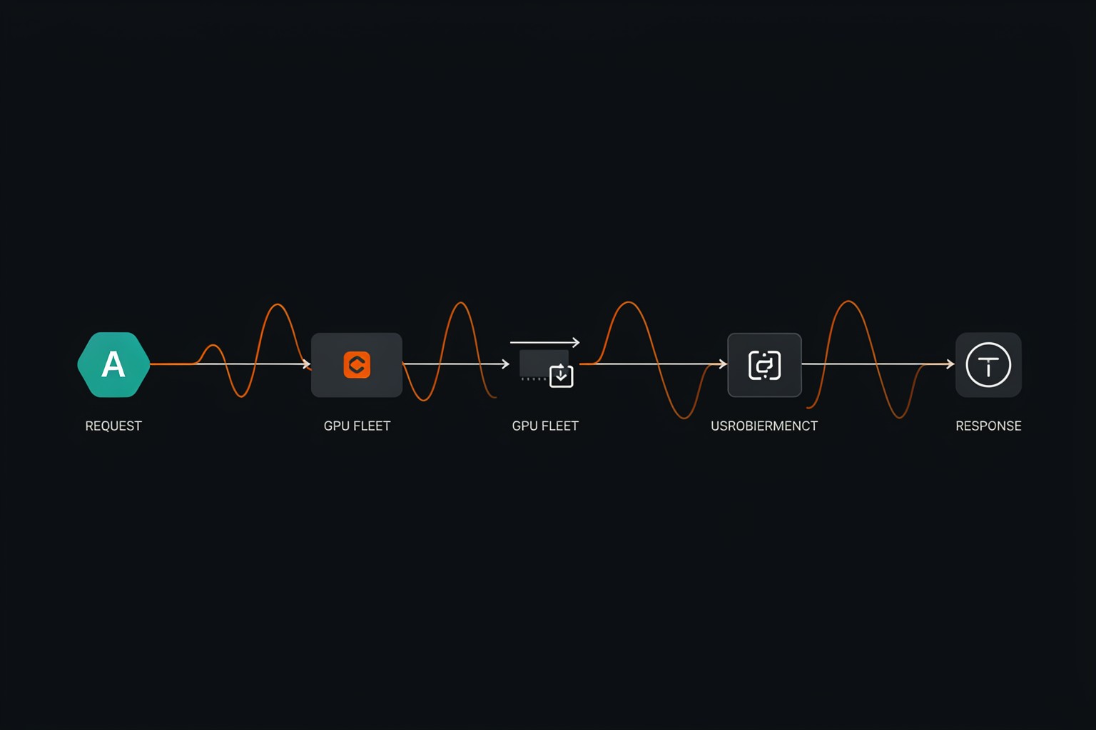
The final test pushes the model toward a systems diagram. It separates the major stages and preserves the directional idea. Fine-grained syntax remains its weak point. Small annotations, exact arrow routing, port names, and retry paths need a human check. That is the point where a visual editor or diagramming tool earns its place.
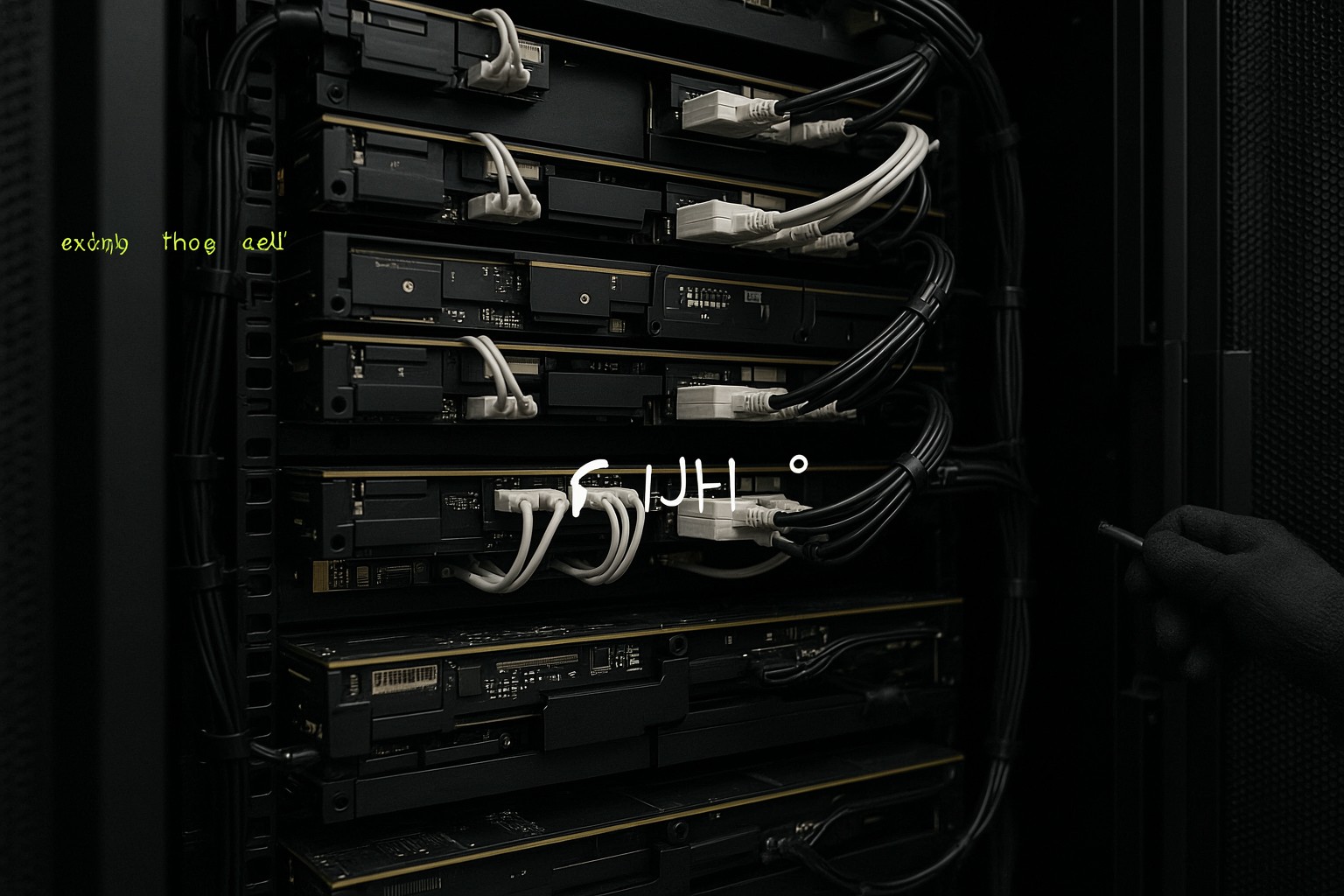
The second new run confirms a useful prompt pattern: describe physical components, framing, and lighting, then leave text out. Accelerator boards, cold plates, and optical cabling make a stronger article visual than fabricated utilization numbers. It also reduces the review burden. The team only needs to check visual plausibility and brand fit, not whether every generated character is correct.
A production workflow that does not create false evidence
- Write the engineering claim in one sentence before writing the image prompt.
- Generate a scene that supports that claim without embedding measurements or detailed labels.
- Review racks, hoses, cables, badges, and human safety details at full size.
- Add approved typography in a design tool when exact wording matters.
- Link the final article to the source benchmark, runbook, or architecture document.
This approach separates visual storytelling from evidence. It also helps during review. An engineer can reject an impossible cable path without reopening the entire article, while a writer can replace a weak image without changing the underlying benchmark result.
Practical takeaways
| Job | Result | Recommendation |
|---|---|---|
| Blog and report heroes | Strong | Use short headlines and scene-led prompts. |
| Concept dashboards | Good | Use for direction, then build the interface. |
| Cooling explainers | Good start | Redraw precise labels and connections. |
| Production diagrams | Limited | Keep source diagrams in a diagramming tool. |
- Keep required text short and place it away from hardware detail.
- Give each image one technical story.
- Use generated scenes for explanation, not benchmark evidence.
- Review every label, cable route, and safety-critical detail before sharing.
- Keep numbers, charts, and topology data in their original engineering source.
P Image Ideogram does not replace technical documentation. It makes the first visual explanation faster and gives infrastructure teams a credible starting point for a capacity plan, inference design, or hardware brief. Run P Image Ideogram Custom on Wiro when an infrastructure story needs an original visual and the underlying technical record stays intact.