
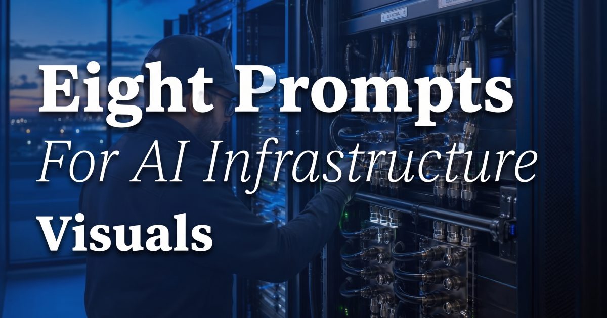
AI infrastructure visuals fail when prompts stop at “server rack.” A useful visual has a job: explain a request path, set the scene for a launch page, show a deployment constraint, or give an operations team a shared picture of a system. These eight prompts were run with GPT Image 2 Custom at 1536 by 1024, medium quality. Treat the results as fast visual briefs, not engineering drawings. NVIDIA’s data-center portfolio itself spans accelerated computing, networking, edge computing, and MLOps, which is a useful reminder that the rack is only one layer of an AI system.
1. Liquid-cooled GPU rack hero
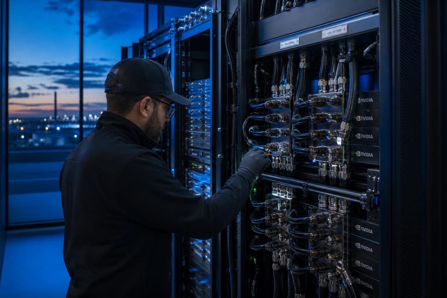
Use a documentary scene to establish scale and human context. Ask for the cooling hardware explicitly, then keep the frame wide enough for a headline later. Prompt: “Editorial photograph of a liquid-cooled GPU rack at blue hour, technician for scale, rear-door heat exchanger, braided coolant lines, realistic cable routing, 16:9 composition, empty dark area on the left for a headline.” The technician matters. It stops the image from reading like a toy cabinet and gives a developer audience a quick scale reference.
Do not let the image imply a cooling design it cannot prove. A cold plate, manifold, pump, and hoses describe a plausible visual vocabulary; they do not establish flow rate, facility-water temperature, or rack power. Use the image for a hero, then put real numbers in adjacent copy or a controlled diagram. That distinction matters as AI data-center design combines compute with networking and facility systems, not just GPUs. NVIDIA’s data-center overview is a useful primary reference for those adjacent layers.
2. Inference-cluster architecture
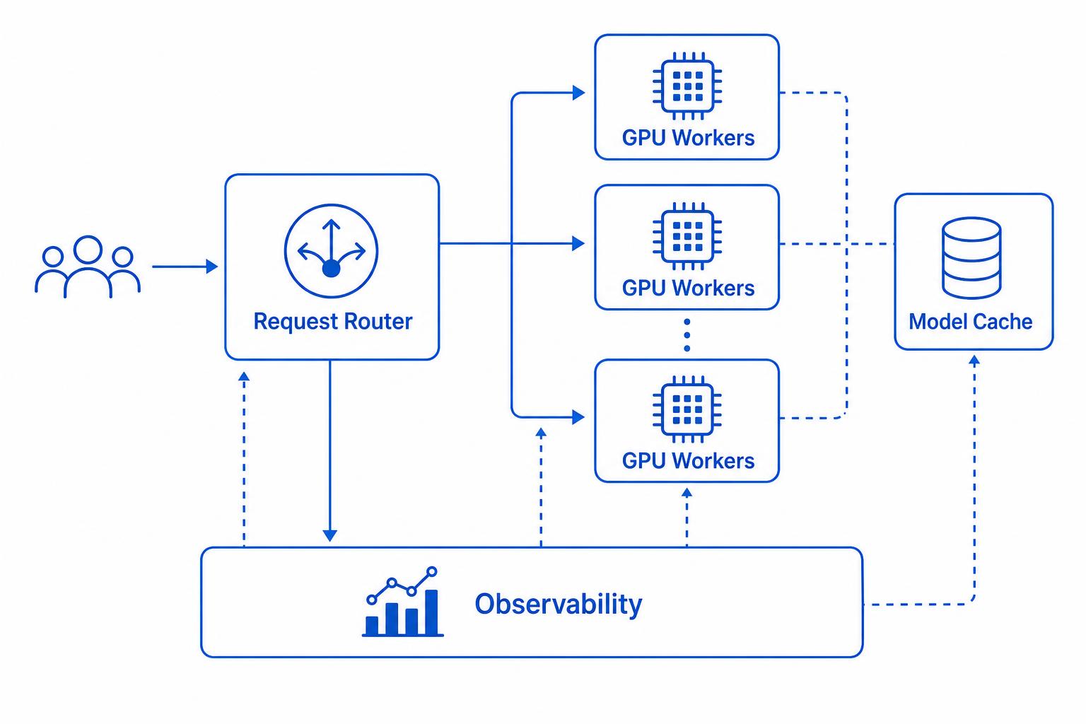
Use a limited label set for an explainer. The hard rule is to verify every arrow and label before treating the result as documentation. Prompt: “Clean editorial architecture sketch, left-to-right request router, GPU workers, model cache, telemetry collector, object storage, six arrows maximum, muted blue and graphite, 4:3 layout.” Six arrows force a decision about the main path. That makes the first draft easier to review than a dense image full of invented queues and protocols.
For an infrastructure team, the value is alignment. Product, platform, and SRE teams can agree on the story before a designer builds the source-of-truth diagram. Then recreate it in an editable tool and add the facts the generated image must not invent: request rate, batch size, model version, cache hit rate, retry behavior, ownership, and failure domains. Juniper’s AI cluster design guide is a relevant technical reference when the sketch turns into a network design review.
3. Edge inference cover
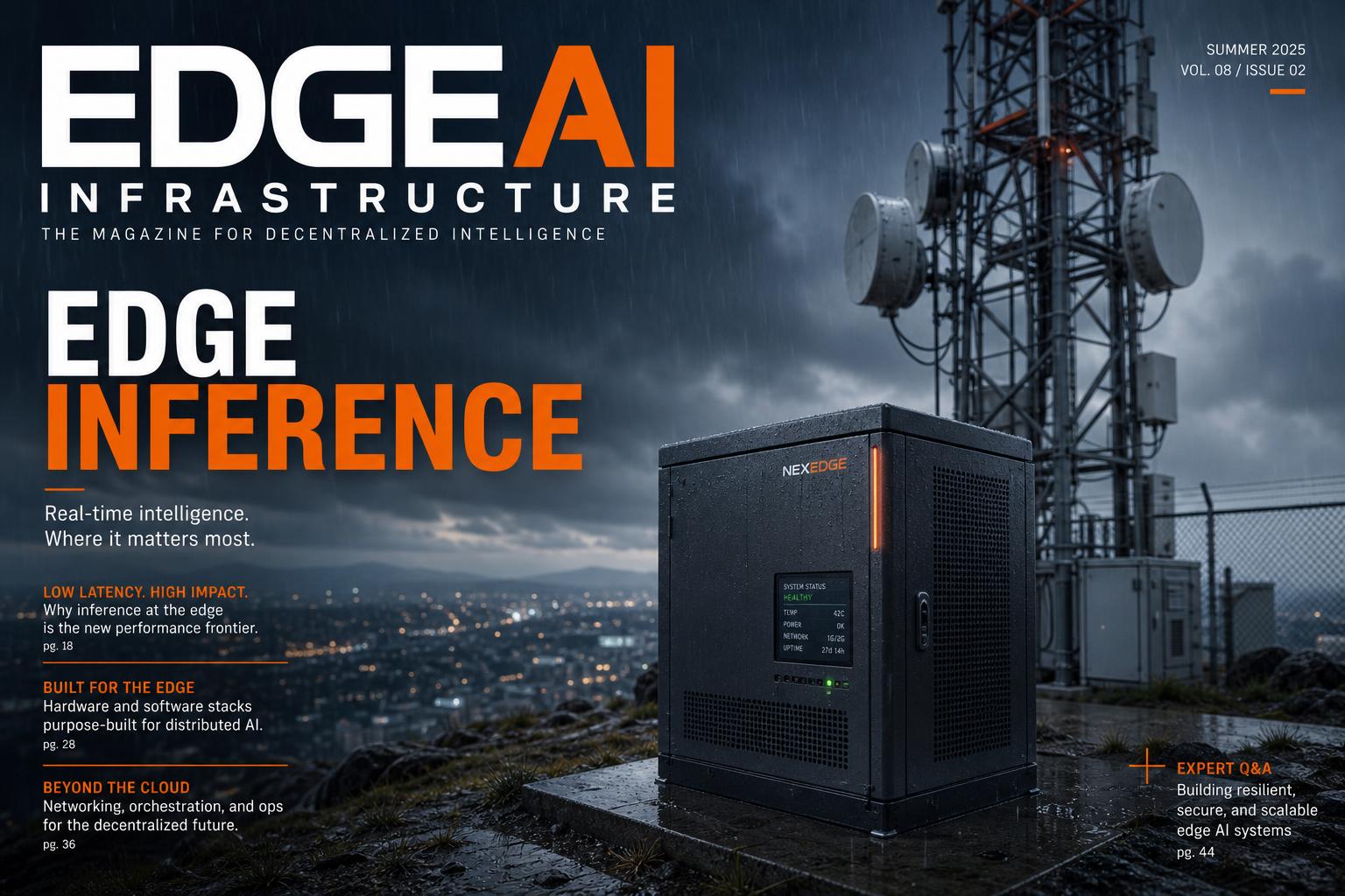
Combine a physical edge node with one environment signal, such as a telecom tower or retail site. Prompt: “Editorial cover image of a compact edge server beside a telecom tower in rain, fiber backhaul entering the enclosure, realistic service access, restrained blue lighting, leave the top third clear for a headline.” One environment signal makes the deployment legible. Two or three can turn it into a generic sci-fi collage.
The operational question should shape the image. For a telecom setting, show backhaul and weather exposure. For retail, show a small locked enclosure and a nearby camera or point-of-sale device. For manufacturing, show a guarded cabinet outside the production area. The visual should trigger a concrete discussion about connectivity, remote access, replacement parts, and what happens when the WAN disappears.
4. GPU server sled
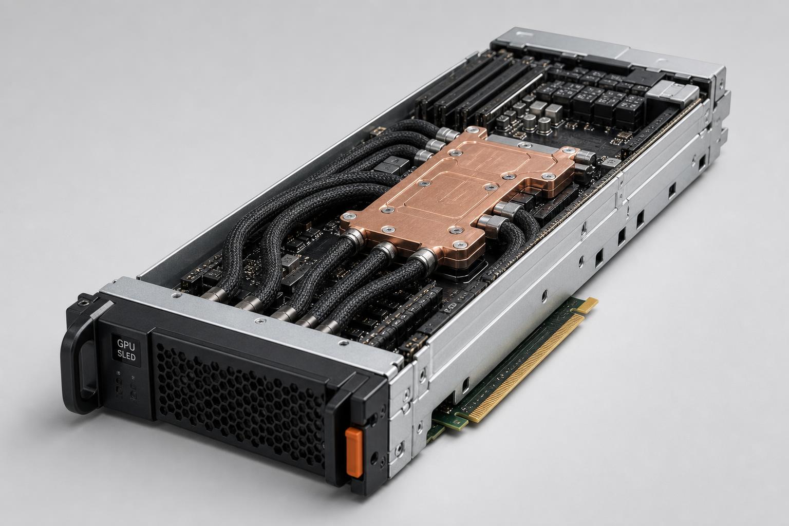
For hardware marketing, use an isolated studio scene. Name the components that make the system recognizable, but do not present the image as an exact mechanical drawing. Prompt: “Three-quarter studio product visualization of a GPU server sled, cold plate, braided hoses, PCIe connector, service handles, dark neutral background, no logos, no readable specifications.” The last constraint prevents a made-up part number from becoming accidental product copy.
This prompt works well for a slide opener, a release note, or a landing-page section. It does not replace a mechanical drawing, a bill of materials, or a thermal validation report. Keep product claims in text that links to the supplier specification. That simple split lets a team move quickly without turning an attractive image into technical evidence.
5. NOC backdrop
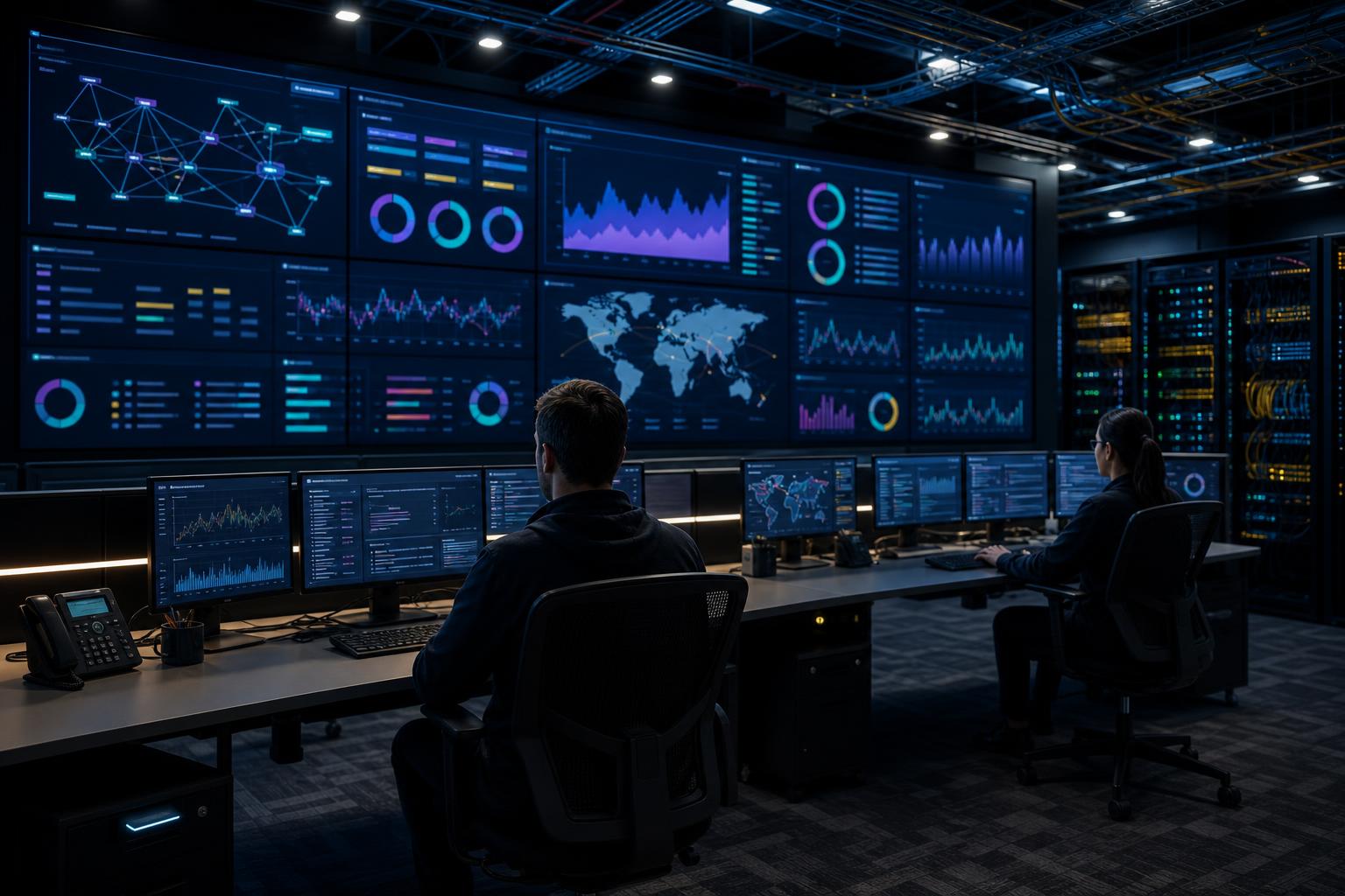
Ask for abstract charts without values when the image is decorative. Prompt: “Wide network operations center, six wall displays with abstract utilization shapes and alert colors, no readable numbers, operators in silhouette, 21:9 composition.” A dashboard backdrop should establish the operating environment, not claim that a cluster is running at 83 percent utilization or meeting a 42 ms target.
That boundary is practical, not cosmetic. Real telemetry needs a time window, units, labels, and a known data source. Generated telemetry has none of those. Put live metrics in the observability product. Use the image in the surrounding narrative where it can support the message without confusing design with measurement.
6. Cooling-loop explainer
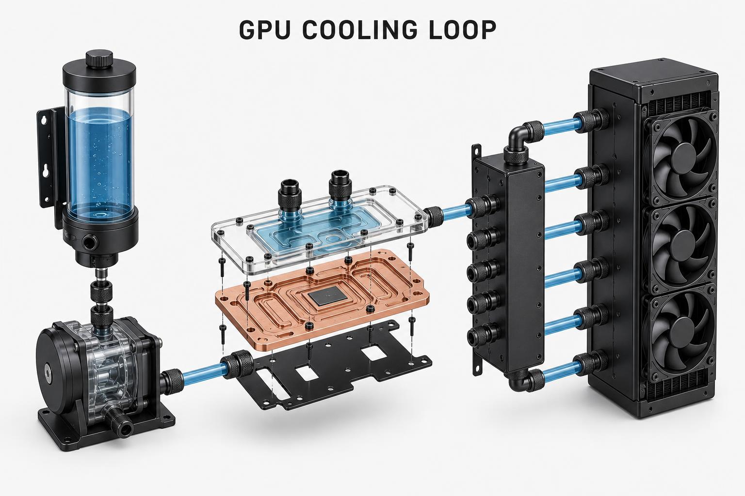
Exploded views work best with a short list of major components. Prompt: “Exploded technical-style visual of a GPU cooling loop with reservoir, pump, cold plate, manifold, radiator, and directional flow shapes, white background, five labels maximum, no values.” Five labels fit on a slide and make review fast. They also leave room for an engineer to identify what the model missed.
Use the output as a composition study. Rebuild the approved version with vector shapes and verified labels. Add flow direction, isolation points, sensors, and maintenance boundaries only after an engineer signs off. A visual model can suggest hierarchy; it cannot calculate pressure drop or confirm that a routing path can be serviced safely.
7. Modular data center and renewables
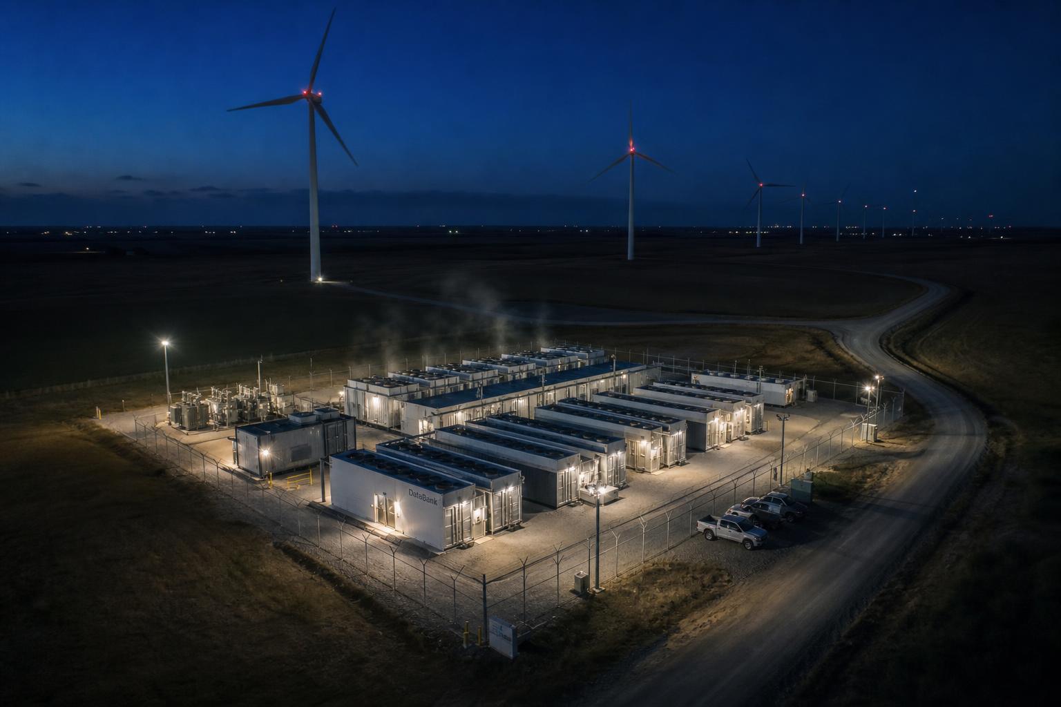
Pair the facility with one energy signal to avoid a generic sustainability image. Prompt: “Photorealistic modular data center at night beside a single row of wind turbines, fenced utility yard, realistic service road, subdued industrial lighting, no logos.” Keep the facility industrial and physically plausible. A single energy cue gives the image a point without claiming a specific power-purchase agreement or emissions result.
Teams should be careful with this category. A turbine in the background does not prove that a workload used renewable electricity. If the page makes an energy or carbon claim, cite the contract, regional grid data, or measured facility reporting next to it. Let the visual carry mood and context. Let auditable records carry the claim.
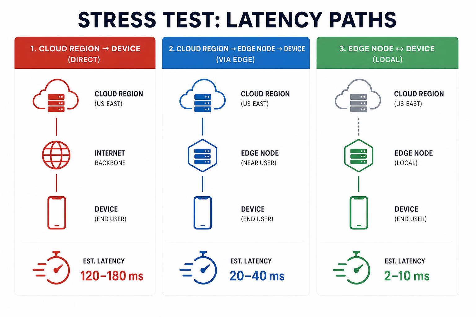
8. Cloud-to-edge latency infographic
This is the stress test. Ask for a three-stage path, not a dense dashboard. Prompt: “Three-column cloud-to-edge visual: cloud region, edge node, field device; one directional path; simple packet symbols; empty label fields; no latency numbers; flat technical illustration.” Three columns give readers a clear path while avoiding the common failure mode of unreadable microtext.
Replace every production label and latency value after generation. Latency depends on route, payload size, batching, model execution, and measurement method. A believable-looking 20 ms badge has no value without those details. For a serious review, show the test location, p50 and p95 separately, sample count, and the exact start and end points. The generated image can introduce the architecture; measured data has to finish the argument.
How to put AI infrastructure visuals into production
- Write the audience and placement first: landing page, architecture review, keynote, or runbook.
- Constrain the scene to five or six essential objects and one clear camera angle.
- Ask for blank label fields or no values whenever a diagram includes metrics.
- Review physical plausibility with the infrastructure owner before publishing.
- Recreate final diagrams in an editable format and link every claim to a primary source.
GPT Image 2 Custom accepts text-to-image and image-editing briefs, with custom pixel sizes and optional masks for targeted edits. That makes it useful for visual exploration and controlled revisions, while the final technical artifact still needs human verification. The model page documents those controls and supported workflows.
Run GPT Image 2 Custom on Wiro to explore AI infrastructure visuals quickly, then finish critical typography, measurements, and technical annotation in a controlled production tool.